The New Brand for The Classy Hippie is Here!
It feels like it's taken a lifetime to get here, but I'm overjoyed that this day has arrived! I have thoroughly enjoyed this process, the ups and the downs, the moments of clarity and confusion, the inspiration and the blocks. I loved // love building this brand from scratch, not just the visuals, but the intangibles - the voice, the values, the beliefs, the services, the mission - and I can't wait to keep going, to keep clarifying and building on The Classy Hippie and the people it's here to serve.
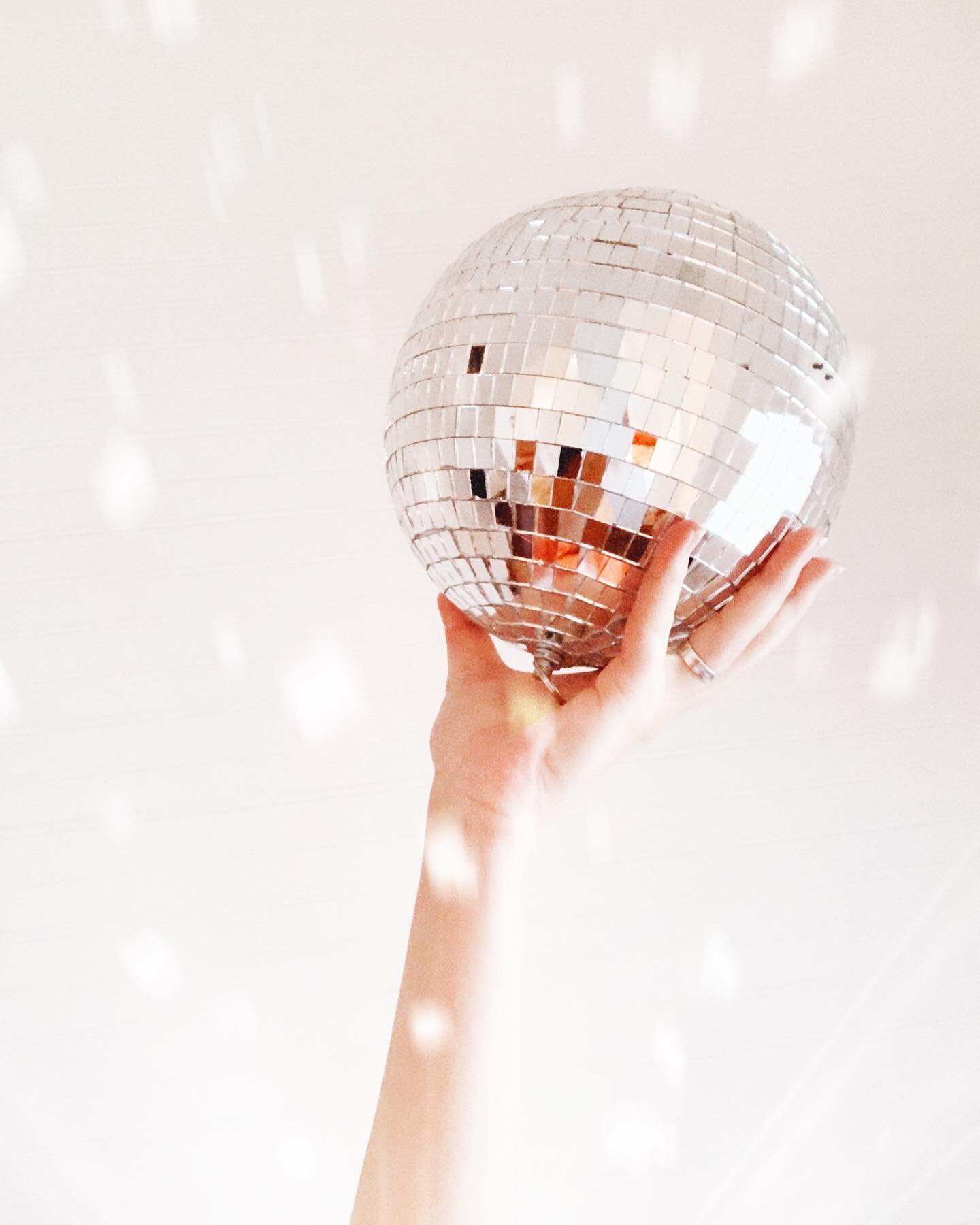
Take a look below at the various visual components as well as a peak into my design process. I hope you enjoy!

MY DESIGN PROCESS
Step 01 // Word Research
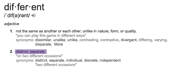
Words play a HUGE part into my process...
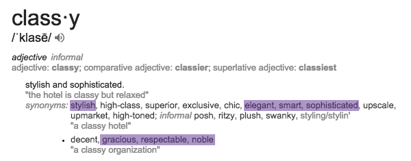
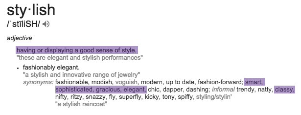
When starting off any design - I like to start with words. Words that describe how the brand is, what the brand is, what the brand wants to become, who the target audience is, what the look and feel is. I spiral down a rabbit hole of adjectives & synonyms until I feel like I have a clear understanding of what the brand is and who it's speaking to.
This can start from anywhere, but for The Classy Hippie - I started with the name and it took off from there...
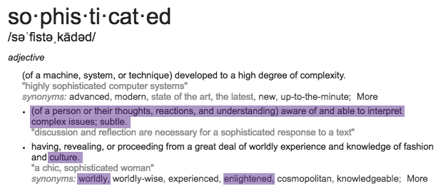
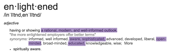
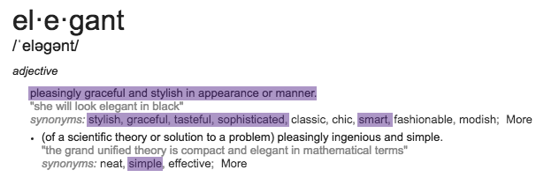
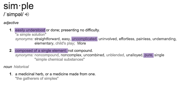
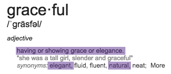
Classy - Stylish - Sophisticated - Enlightened - Aware - Open-Minded - Elegant - Simple - Graceful


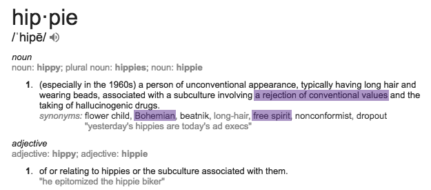
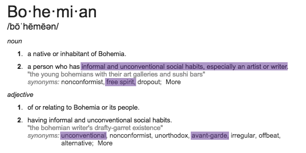
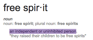
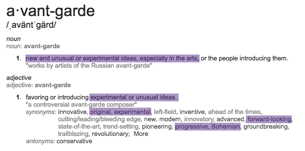
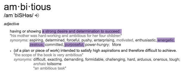
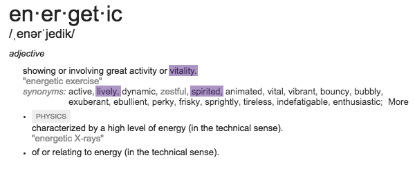
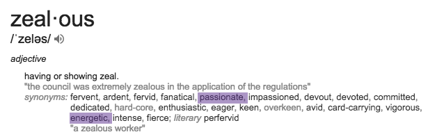
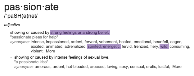
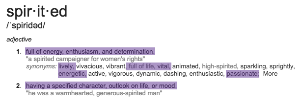
Hippie - Bohemian - Free-Spirit - Ambitious - Purposeful - Passionate - Spirited - Unconventional


Step 02 // Visual Research
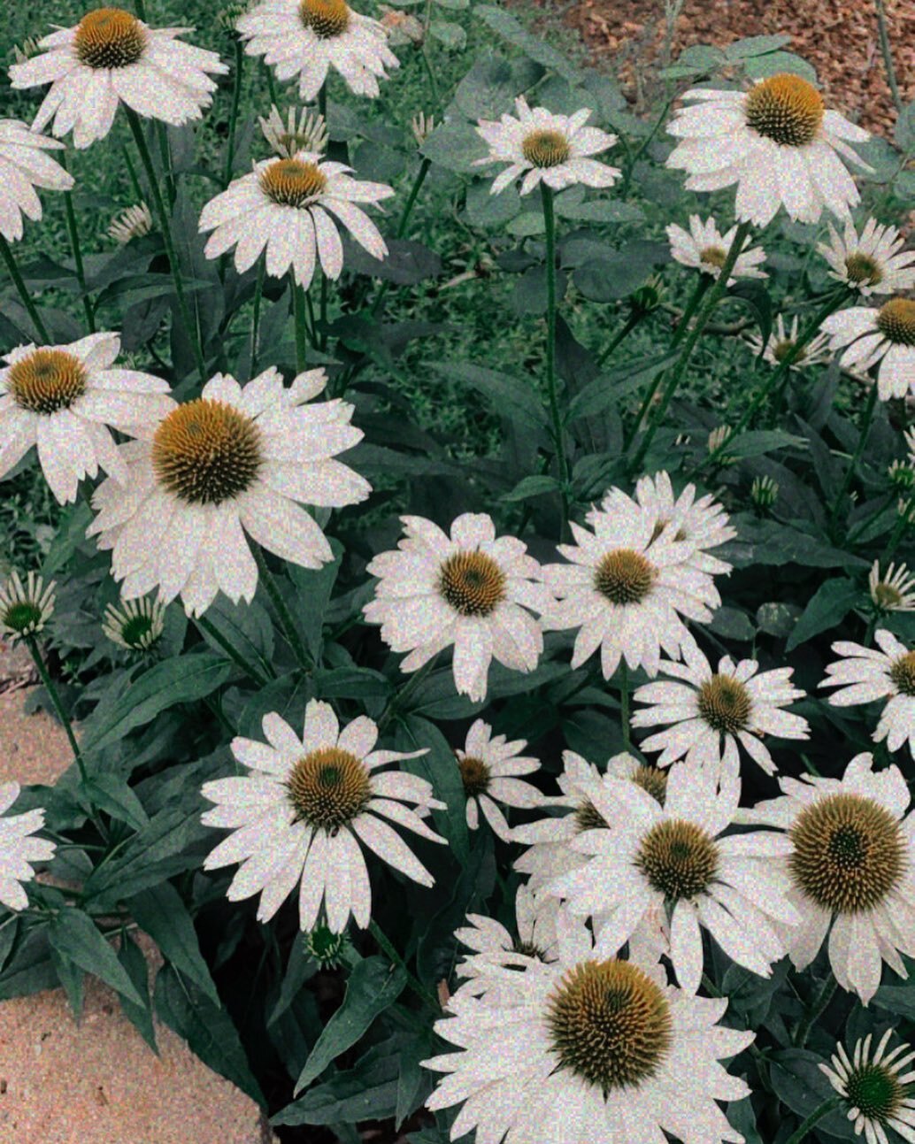
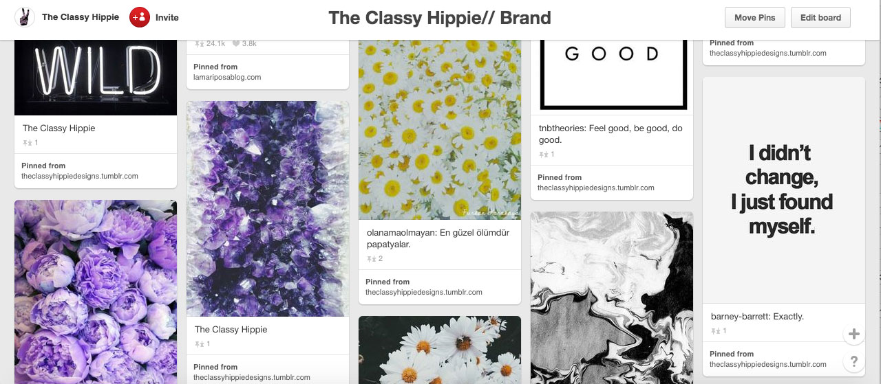
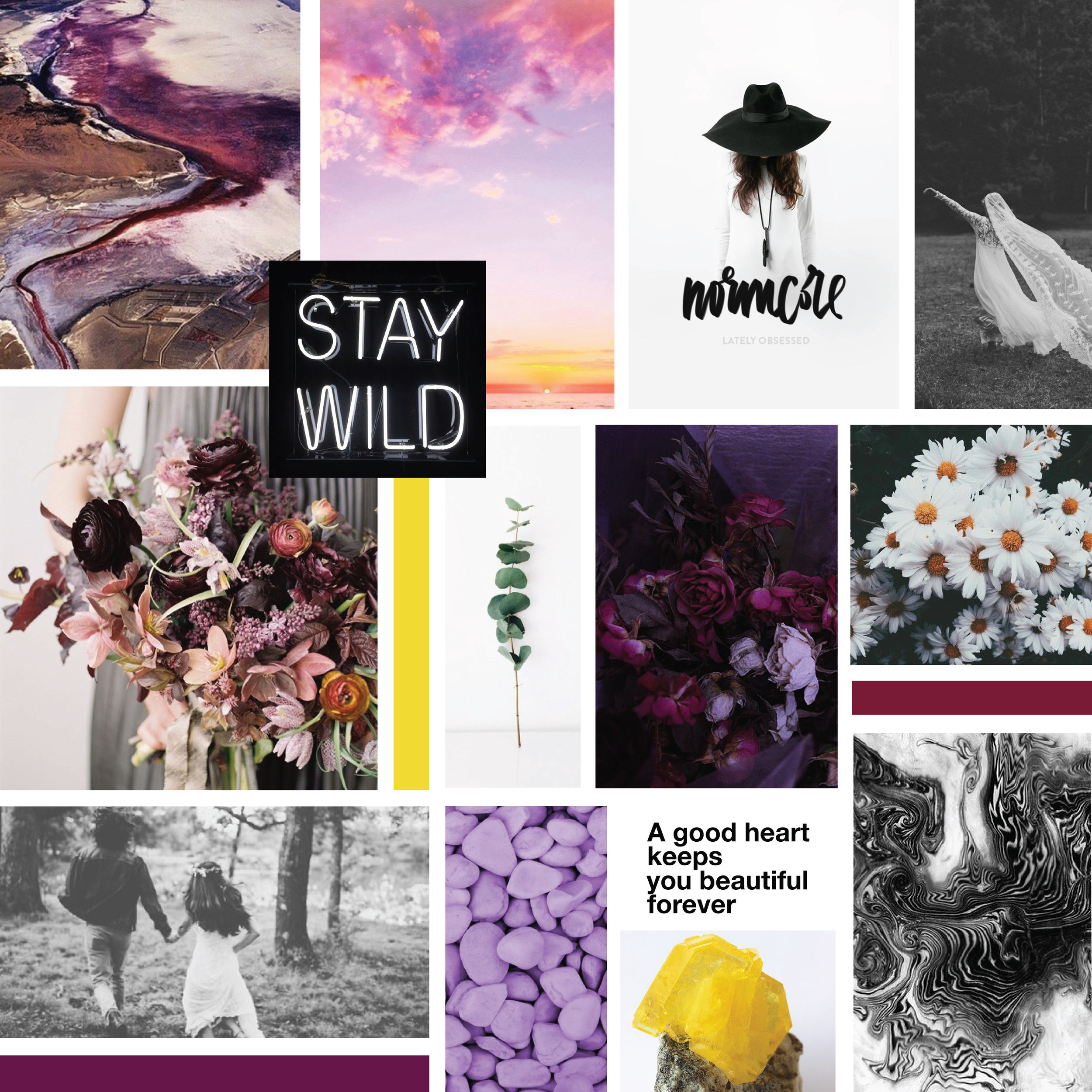
As I'm pouring over these words - colors, images, music, movies, quotes, lyrics, textures, etc. start to flood into my head and the creativity really starts to flow. From there I go to Pinterest and start compiling an inspiration board filled with visual references and inspiration for the brand. This step is basically a mental dump of anything and everything that I feel could visually connect with the brand. Below are a few peaks into my own secret pin board.


Step 03 // Exploring & Refining
I do a lot of writing in this stage in order to narrow down and clarify. For my own brand, my pin board got upwards of 500 pins - that's A LOT! In order to narrow it down, I go back to my lists of words, my "Why", my target audience, my services, etc. As far as visuals go, I determined that I needed a lot of juxtaposition because I was representing two different aesthetics in one brand - Minimal, Simple, Modern & Clean with Texture, Nature, Patterns & Color.
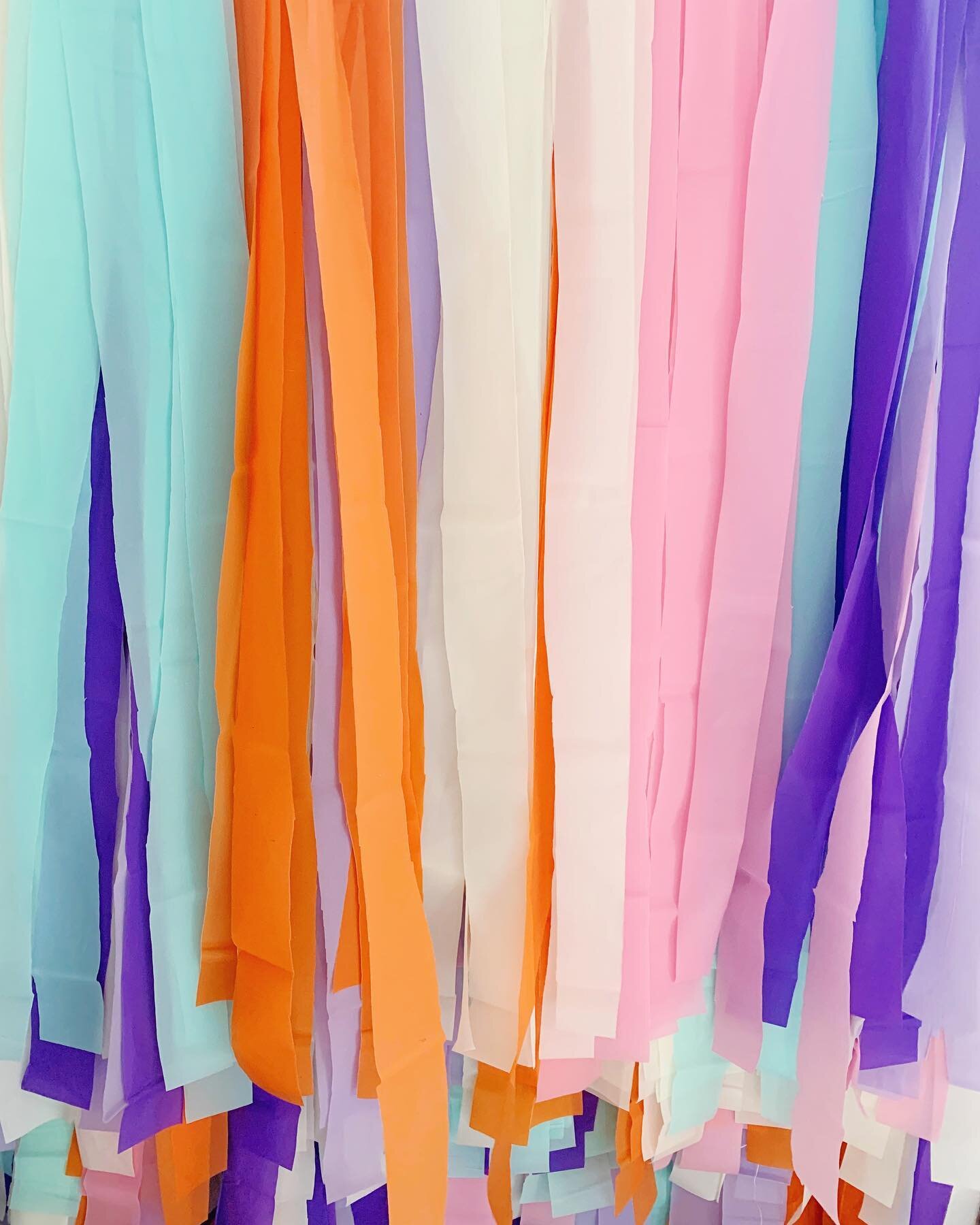
When it came to color, I wanted a palette that could convey both sophistication and play, simplicity and texture. Black, White & Grays were obvious... but what would the other colors be? Early on, I leaned towards purple and yellow - harkening to amethyst and daisies.
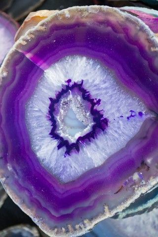
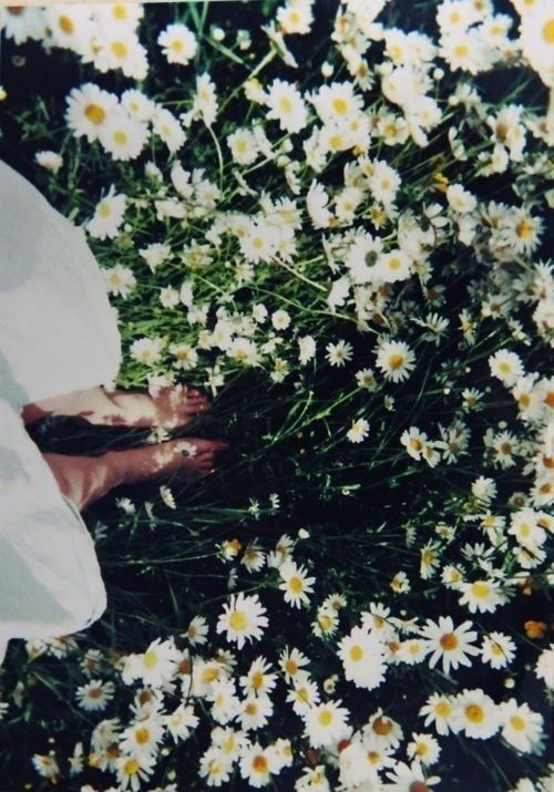
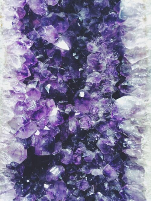

The purple and yellow alone gave off a cheerful nod to free-spirited luxury, but it didn't speak to the moody sophistication I was also looking for...until I saw this landscape image. The combination of the lavenders and the burgundies were perfect! AND I already owned a few lavender tops as well as my trusty burgundy hat [please let fall get here, so I can start wearing it again!]
Once I had a better feel for the colors, images and graphic style I would be using - I compiled a mood board to use as a visual reference when designing my brand. The mood board isn't a literal representation of the brand, so you may notice not every single thing in the board was represented in the final design of the brand. Mood boards just serve as a starting point, to well, make sure you're capturing the mood you're after for the brand. During design, I reference both the mood board and my list of words to keep myself on track.
Step 04 // Brand Design
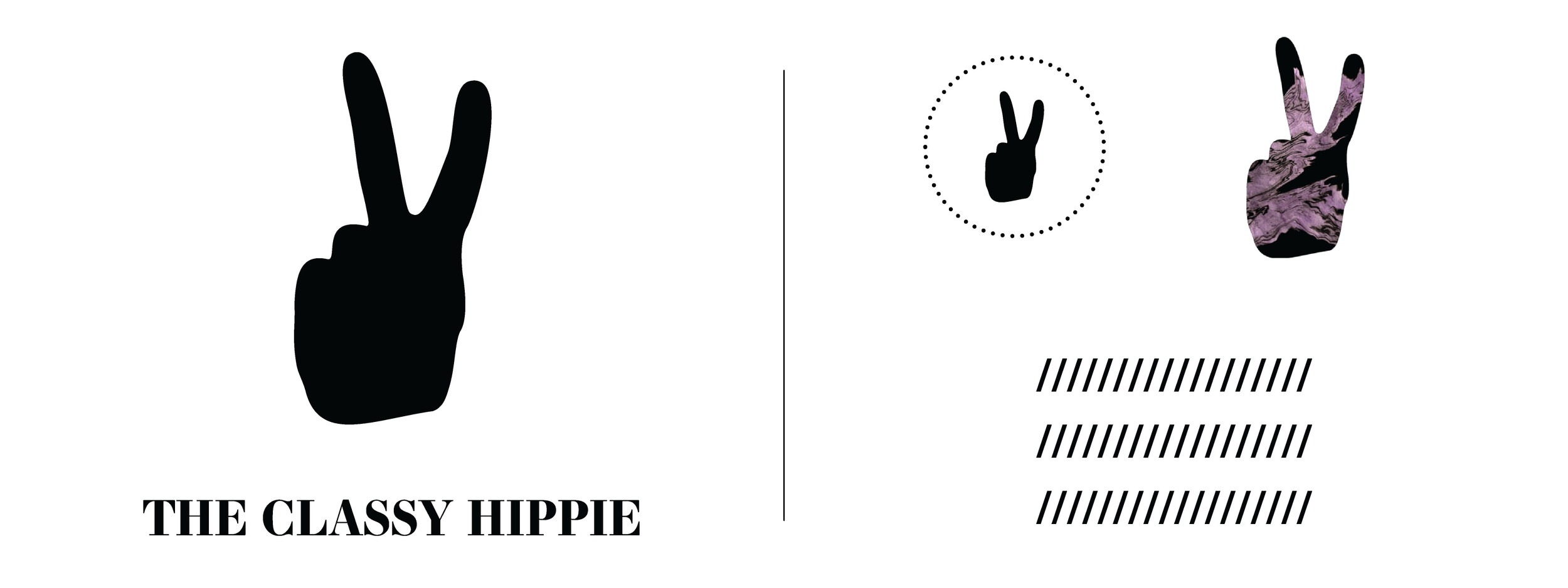
Once I start designing a brand I don't have any particular order when it comes to Logos, Typefaces, Color Palettes or Patterns. I start wherever it makes sense to start for each project and let inspiration lead the way. For The Classy Hippie, I had the mark [The Peace Hand] for a long time already but not the Typefaces, so I started with Color.
Color Palette
I pulled all of the colors from the mood board above and tweaked them until I was happy with the combinations. The top line are the main colors - the ones I'll be using over and over again - and the bottom ones are accent colors to offer a variation and allow me to represent the moody side of the brand as well as the cheerful side.

Patterns
Patterns are some of the most fun things to create. I don't consider myself an illustrator, so I rarely create illustrated patterns. I like to make my patterns by hand using various art forms and then scan them to use for different brand elements along the way. For The Classy Hippie, I used inks in three different forms. The Flowers, Suminagashi [my absolute favorite thing to do!] and Feathers are all visual cues to 'Hippie' and the use of mostly Black and White are cues to 'Classy'.

Logo // Mark // Typefaces // Business Card
Again, looking for that juxtaposition - I knew I needed a Serif and a Sans Serif font that could work on both print and web. I went with Essonnes Bold for my Display // Logo font and Proxima Nova to be used for everything else. I wanted to keep it simple and Proxima Nova is a great simple, clean and versatile typeface.
As for the mark itself - nothing says Classy & Hippie in a clean and simple way better than a symbol of peace. I knew I wanted to use the peace hand as opposed to the peace sign from the start, but deciding on how much to make it look like a hand vs. a perfect illustration was a bit of a struggle at the beginning. In the end, I opted for making it appear more like a hand [Bonus points if you can guess who's hand it's based off of], to include some imperfections - I felt that was a happy balance between the clean and crisp and the textural quality I was looking for.
Once the typefaces were selected and the mark was finalized, the logo and other graphic elements // collateral were simple to put together.


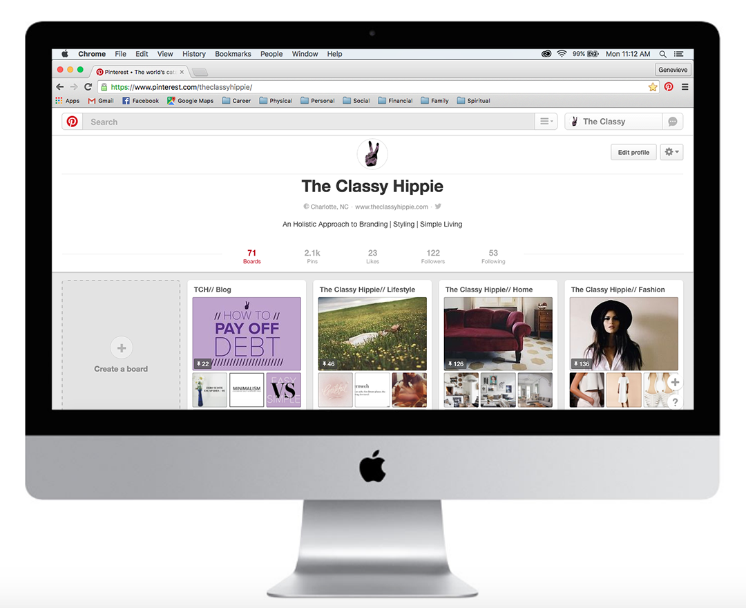
Social Media


There you have it - the start of The Classy Hippie brand! I'm so excited to keep creating and building this brand - it's a dream come true! .
In need of some Branding help yourself? If you'd like to grab a spot on my calendar - contact me HERE.
Until next time - Thanks for reading!
Love & Blessings,
Genevieve