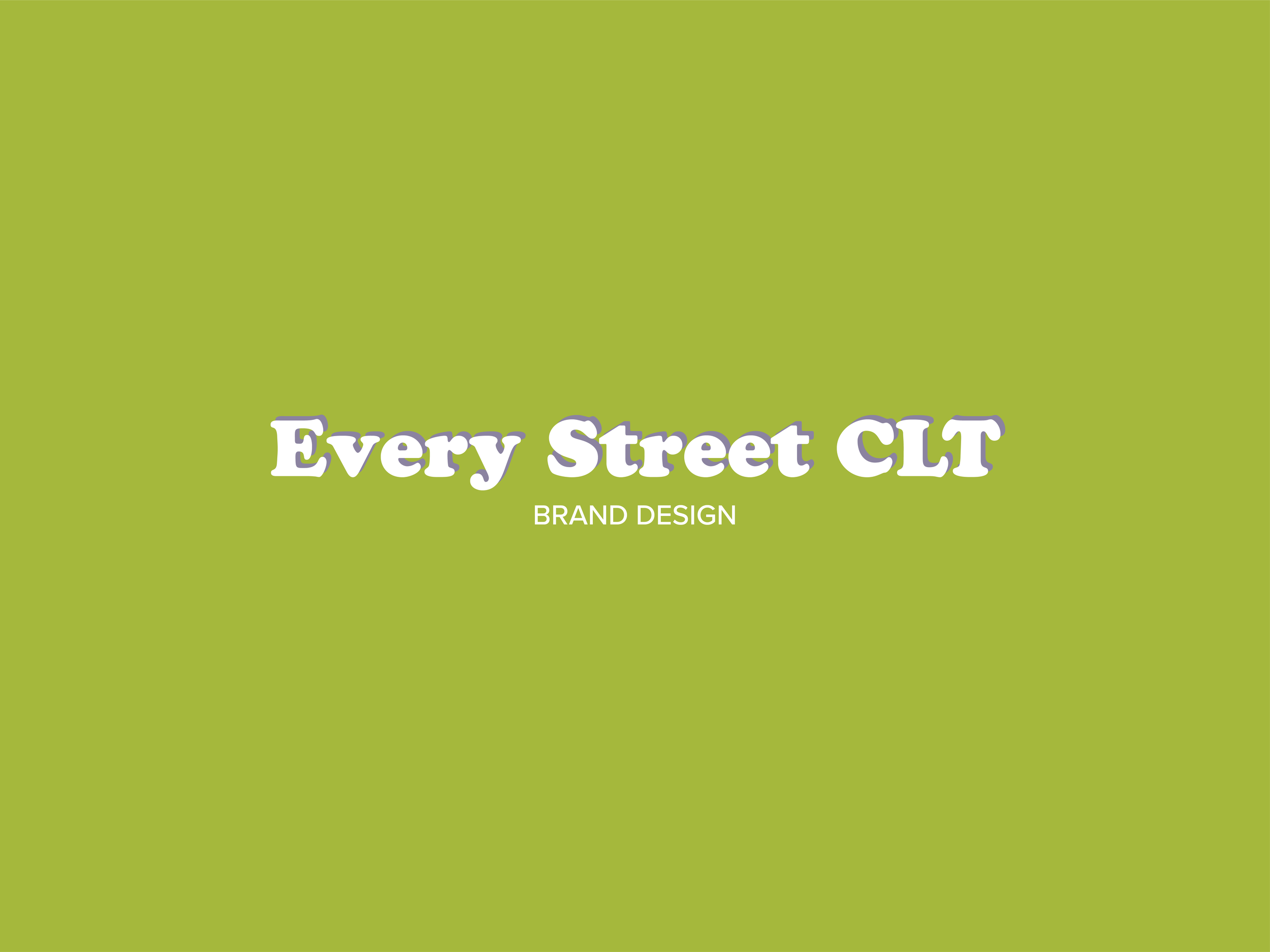
I'm excited to share the completed Brand & Website Design for Every Street CLT with you! If you've been following along for the last three weeks, I've been using this opportunity to do a LIVE behind-the-scenes look at my client // design process. The last four posts have been heavily focused on the client side of the process, but this one will take a closer look at my design process.
Catch up on past posts below.
My 3-Week Client Process // Getting Started
My 3-Week Client Process // Week 01
My 3-Week Client Process // Week 02
My 3-Week Client Process // Week 03

A Glimpse into the Background...
First off, Every Street CLT is a personal project of mine. I want to walk or ride down every street in Charlotte, photographing it along the way. I want to get to know this amazing city better and I couldn't think of a better way than to walk it's streets, comb it's neighborhoods and meet it's people PLUS get to take photographs of beautiful details along the way.
Charlotte is at a critical turning point right now. There's many who say it's hopeless and that greedy developers are ruining its character and creative people are leaving. However, there are many that are starting so many amazing programs that focus on the creativity and the needs of the people. I myself have been overwhelmed by how much is happening here - you need only look. After all, you find what you're looking for.
With all of that in mind, I knew that the brand needed to capture some of the historical texture but also bring light to it's modern potential. I tend to agree that a lot of awful looking buildings are getting built here, but I don't ever think it's too late. We can protect our city's history and come together to make its future BRIGHT and flourishing!
I'm still deep into figuring out how to accomplish that, but I think it starts with community and starts with people gathering to talk about Charlotte and how to make it better. Groups like WeLoveCLT and CreativeMorningsCLT are doing JUST that - to name only a couple.
These were the things I had in mind while designing. Every Street CLT is currently a solo project, but it won't necessarily stay that way. I have thoughts of making it a Meetup group and talking to developers, community leaders, the city, etc. about how citizens can get involved in their city and the future of its built // sustainable environment.
Those are pretty lofty goals currently, but for the time being, using it as a tool to see more of Charlotte and to get to know the city better are the main goals for the project.
Week 01 // Discovery + Identity Formation
I enjoy all three weeks of the process but I especially LOVE Week 01! I get to nerd out and research the brand, the history connected to it and more. I had a sneaking suspicion that I would go with the color Green for the majority of the branding because it's associated with the earth, the environment, greenery, plants, etc. which brings some much needed contrast to the rigid & fixed buildings.
I love contrast and juxtaposition. I feel like it's necessary in design because without it, design often falls flat and is one-note. That doesn't appeal to me. I believe design should emulate life and life is not one-note. We are complicated beings living complex lives. We aren't one-sided and therefore our built environment and designed world shouldn't be either.
That being said, taking pictures of buildings and architectural details can start to feel a little lifeless. That's why I wanted to bring Green in, to offer contrast and to bring life into the project. While researching, I discovered that Queen Charlotte, our city's namesake, was a patron of the arts and an amateur botanist. Well, that discovery solidified the decision to use Green in the branding - at least for me.
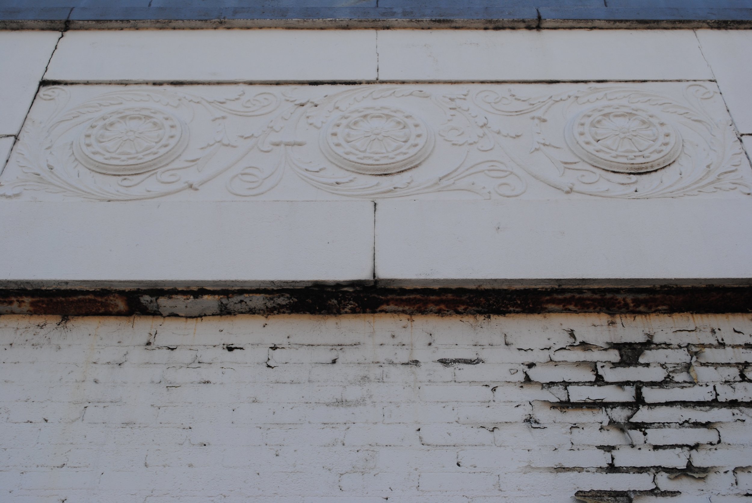
Below is the Mood Board for the brand. I brought in historical references to Charlotte like the Black & White map from 1877 as well as an image of spools of threads to speak to Charlotte's history in the textile industry. The image of the concrete with ornate detailing and the image of the modern glass facade in shades of green represent the contrast I'm going for. Next, we have Queen Charlotte herself and her tiara.
When I saw her tiara, I fell in love with it! It's absolutely gorgeous! I knew I wanted the logo to be somewhat reminiscent of the 'W' you see below, with detailing all around it, but to be in the shape of a crown tying it back to Queen Charlotte's tiara.

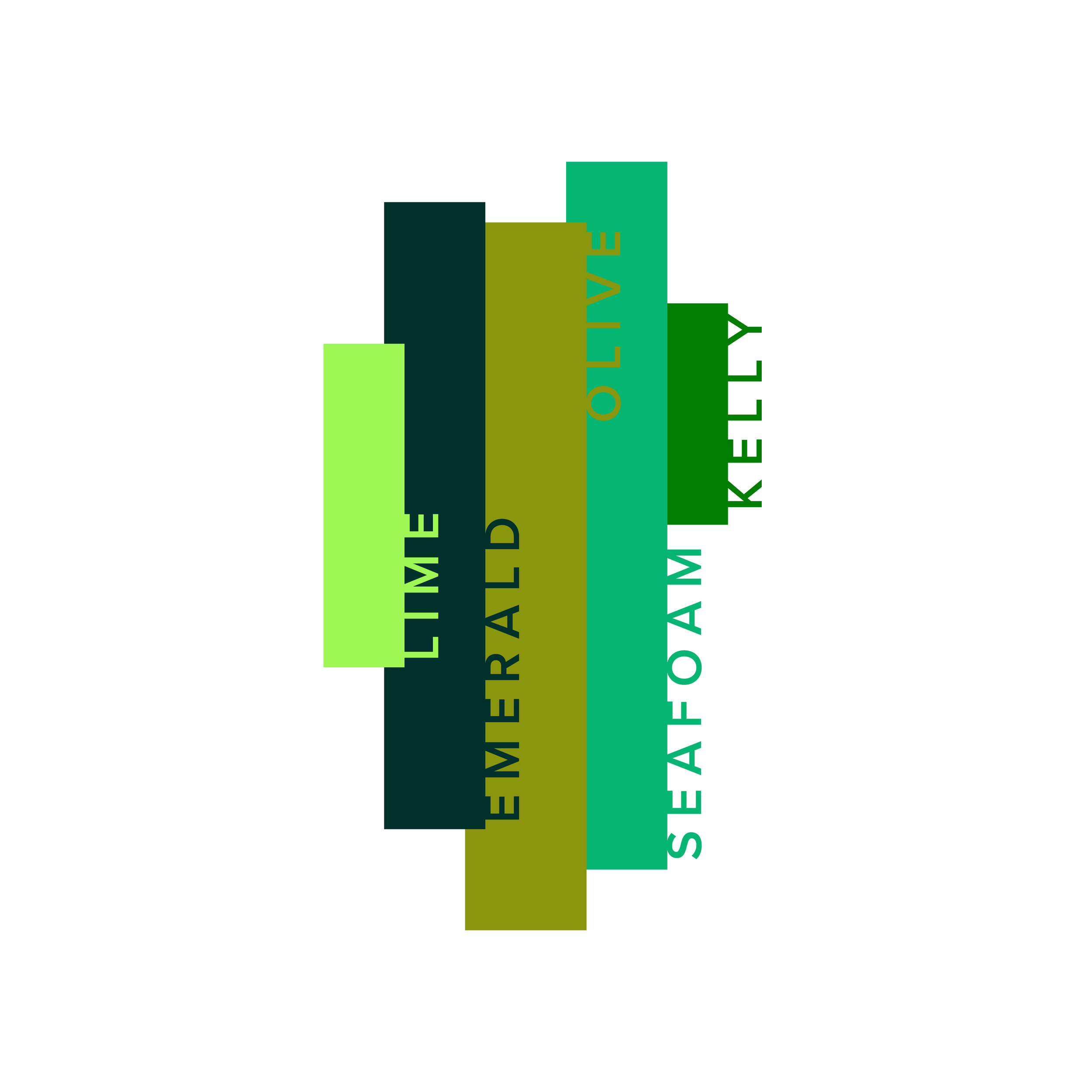
The colors came directly from the Mood Board itself. I chose these five specifically to offer contrast between a more 'traditional' color palette and a 'modern' color palette. For instance, when the emerald and olive green are combined the two colors have a rich // traditional context, but when you add the lime or sea foam green, the color palette becomes lighter and fresher.
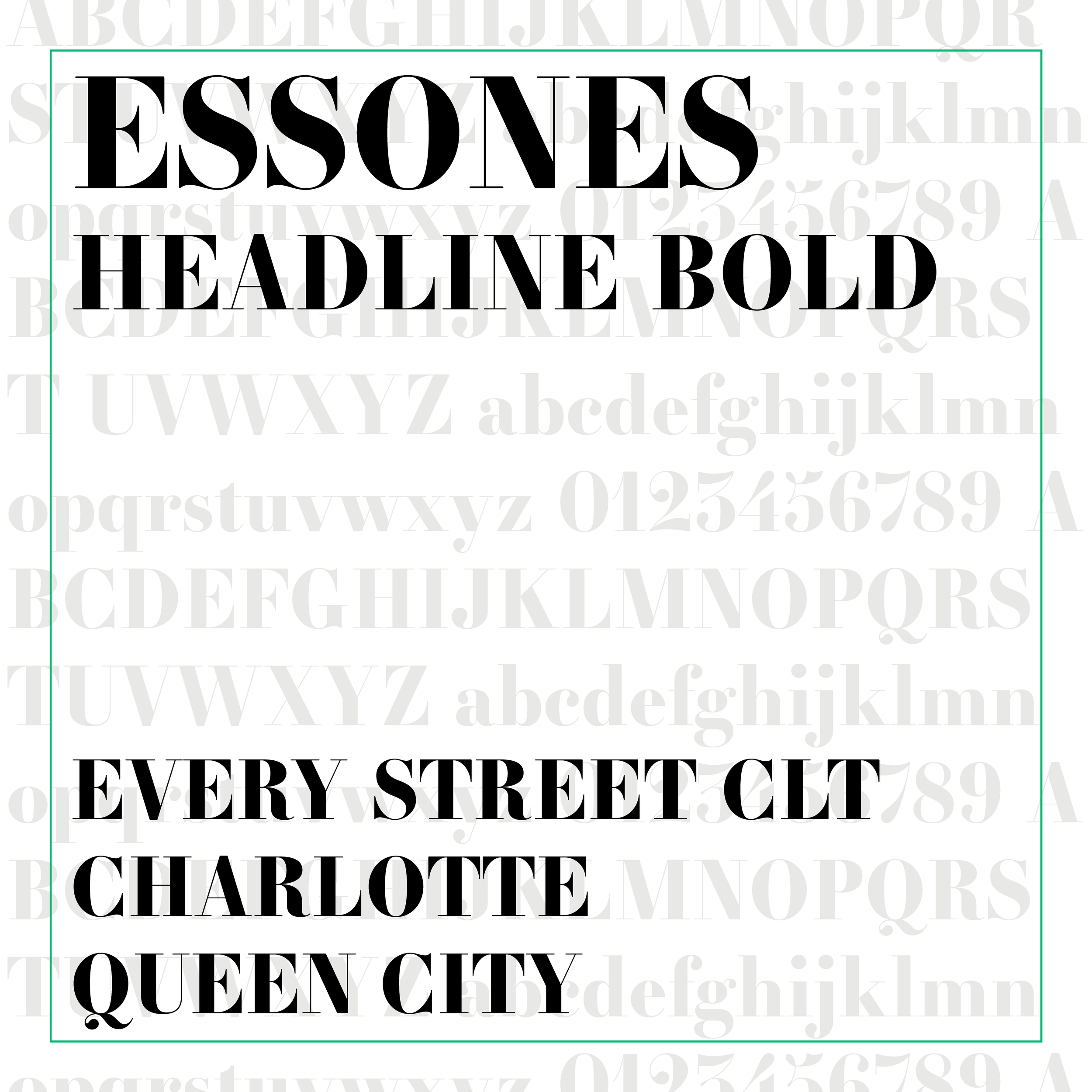
Below are the two typefaces I've chosen for the brand. Essones is one of my favorites because it perfectly balances between classic // traditional & clean // modern. I knew I wanted to bring it in as the Logo // Display typeface. I specifically went with the 'Headline Bold' for the contrast between the thick solid elements and thin lines that comprise the font.
Next I chose Proxima Nova to be the typeface for basically everything else. I love this typeface as well because of its clean and simple design. I chose 'Thin' to be the body text and thicker line weights to act as various headings on the site and possibly future print material.

Week 02 // Identity Refinement + Collateral Design
As I shared in my blog posts covering my Client Process, Week 01 & 02 often blend together. I've broken each day into specific tasks only as a starting place and not as a rigid schedule. Every project is different and thus each step of every project takes a different amount of time, but all in all the entire Brand design is completed within those first two weeks.
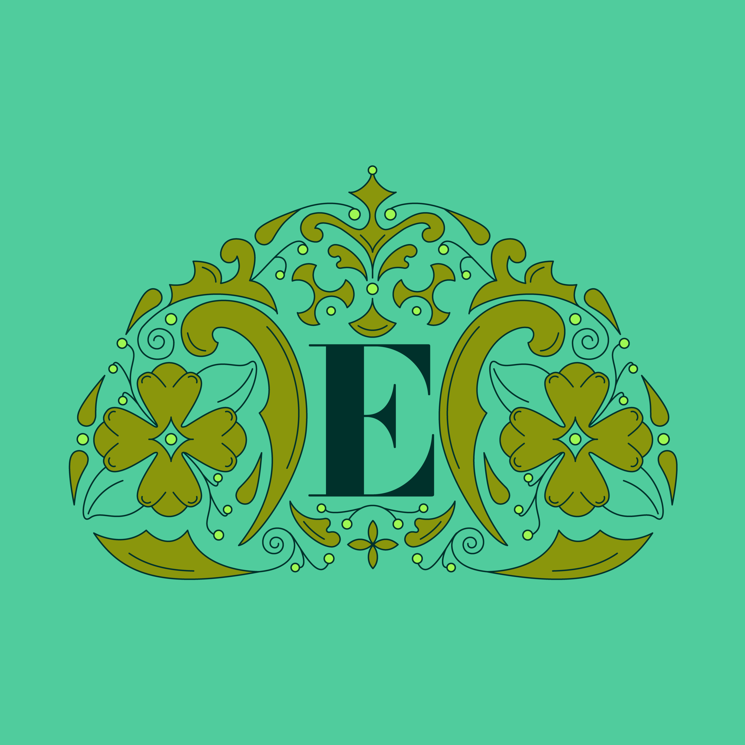
That being said, Week 02 is generally dedicated to spending a little time refining the final logo and the rest of the week on Collateral Design. For Every Street CLT, I knew I didn't need any collateral at this time [business card, letterhead, thank you card, etc.] so I spent Week 02 refining the two different logos for the design. One in the shape of a crown, for icons and graphics, and one in the shape of a street sign as the main logo.

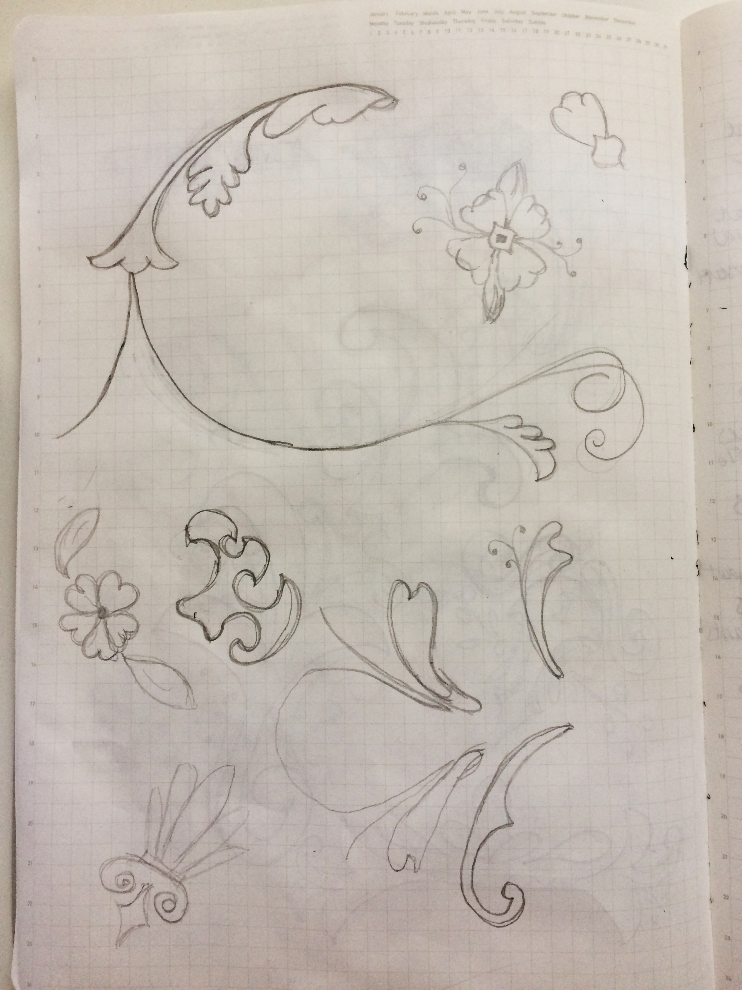

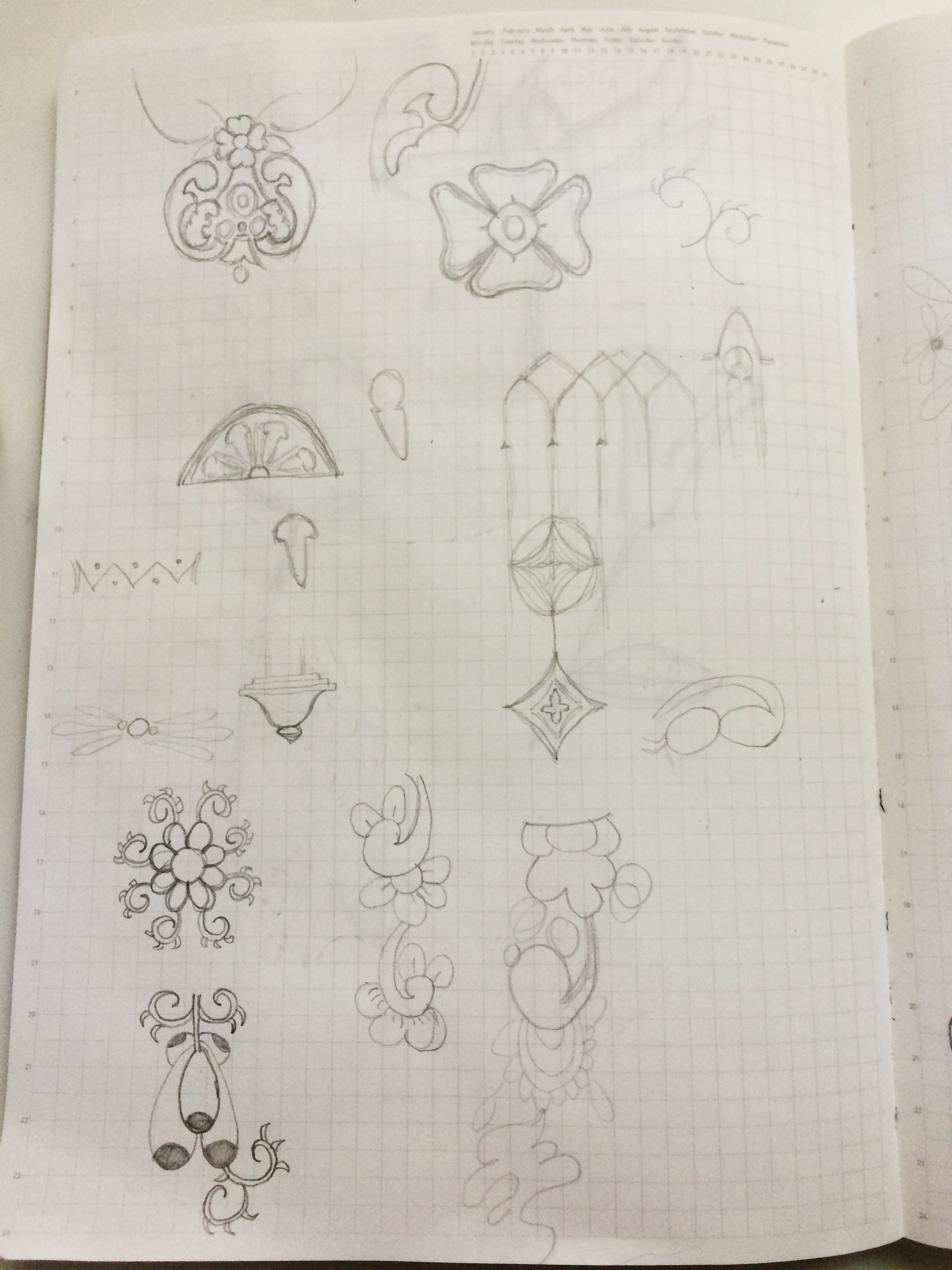
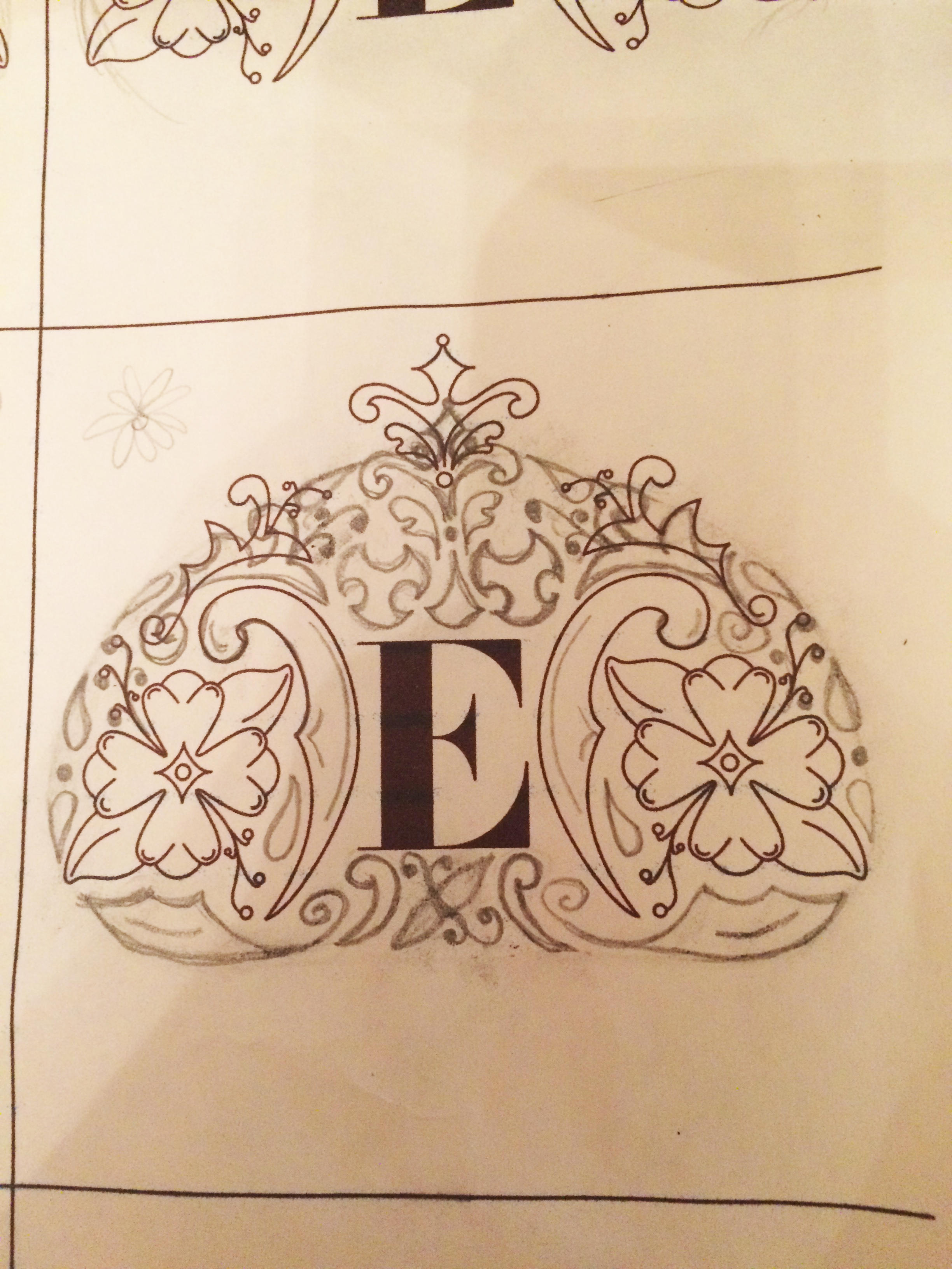
I started with the design of the crown logo because I knew it would be the most detailed and once it was complete, I could take an element or two from it to add detail to the street sign logo. I took some of the sketches from Week 01 [above] and started working them into a crown. I found a few elements I liked along the way and started to place them with the 'E' for the crown logo.
To help me sketch out some different crown logo ideas, I made a quick 'E' logo template [middle below] with the 'E' in various sizes to test out some of the design pieces from my sketches and see if I could make them into a crown. I initially decided on the flower shape combination in the first picture below and went from there.
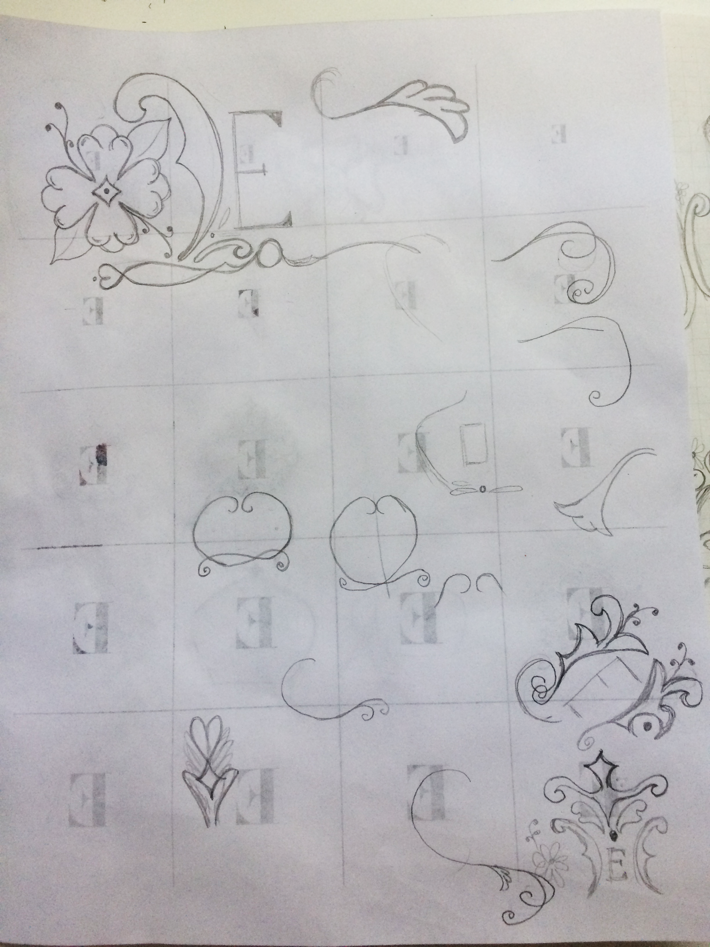
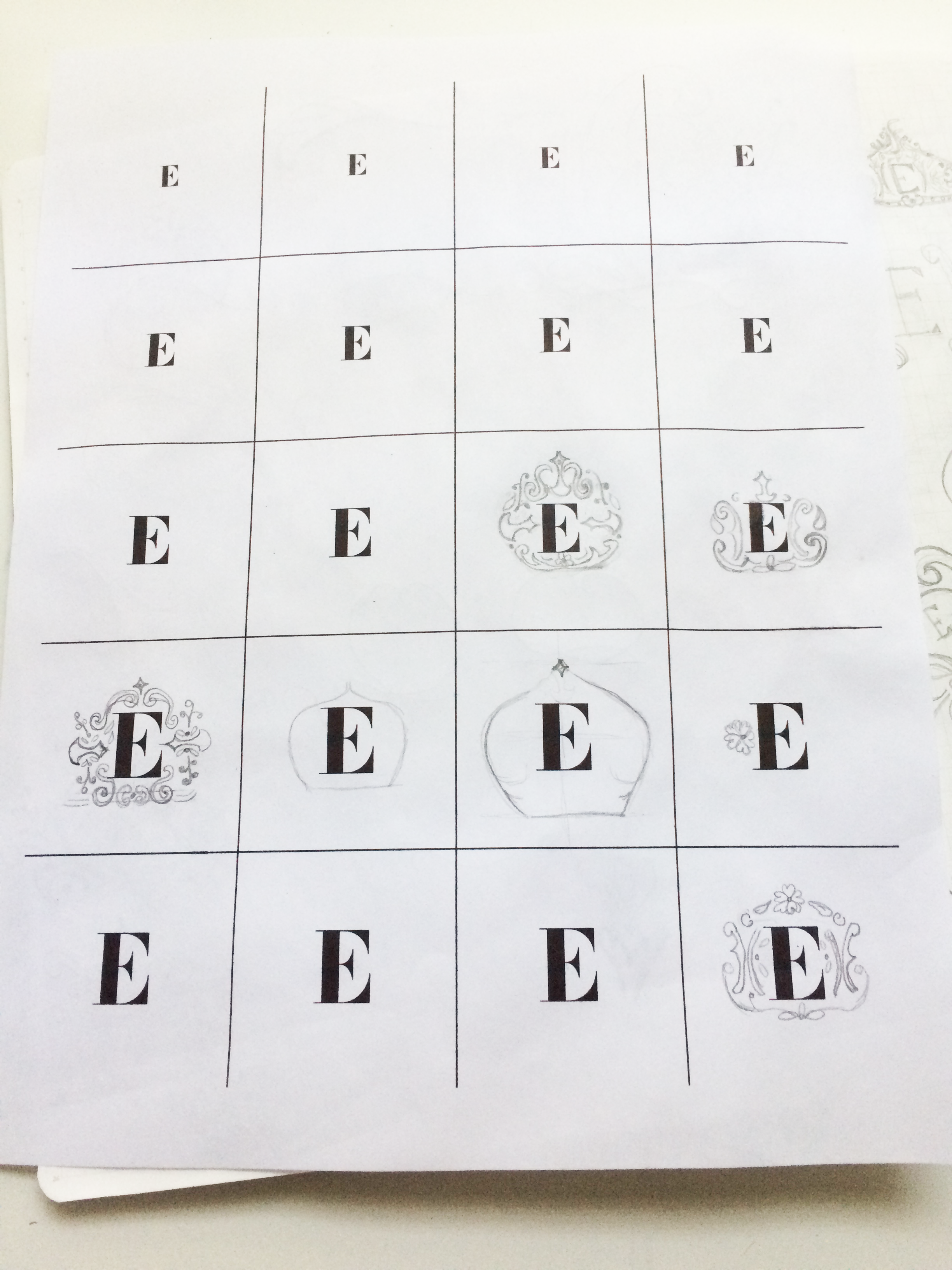

Next, I created a new logo template that included the flower // shape combination [above right] in order to work out the other parts and pieces it would need to make a crown. I ultimately went with the sketch below [left] and got to work on digitizing it and making it a reality [right.]


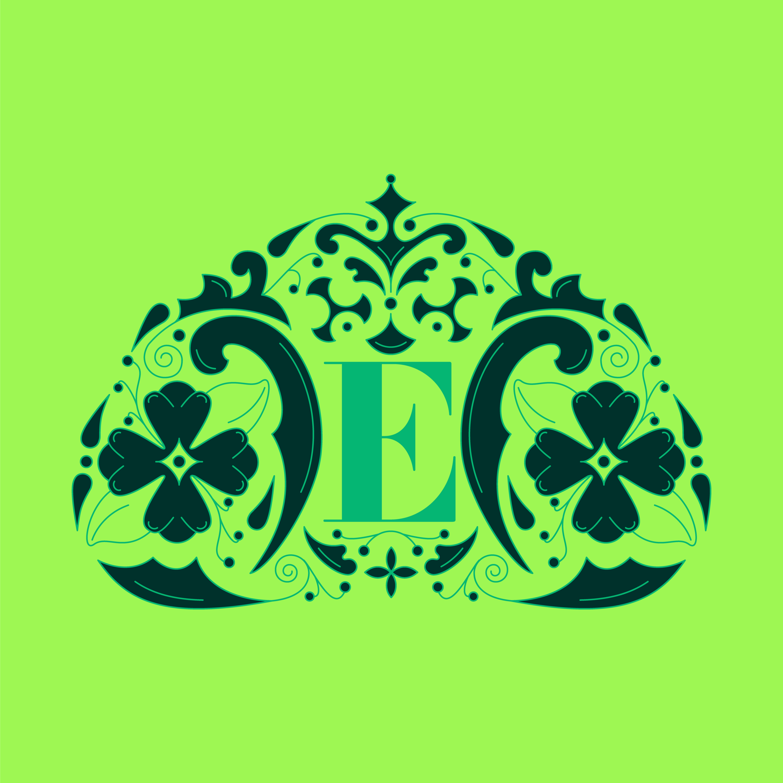
The final crown logo.
Week 03 // Website
Now that I had the crown logo completed, I could move on to designing the street sign logo that would be the main logo for the website. For this, I took the top portion of the crown and added it as ornamentation to the top and sides of the street sign.
In Charlotte, and possibly other cities, our street signs are green with the name of the street in the largest font size and the block that it's on in a smaller size in the upper right corner. I placed the 'CLT' in this position to tie the logo back to what our actual street signs look like.

The final street sign logo.
The website itself didn't need to be too complicated. I needed a Home page, About page, Contact page and a Blog to be a home for each Street Adventure and the photos I took along the way. Should Every Street CLT become a Meetup in the future, I'd create an Event page as well with a calendar to show all upcoming adventures.
I also plan on creating Map graphics showing which streets I've done, categorized by neighborhoods, once I have a few more under my belt. When that day comes, I'll make a Map page to house those graphics. For now, it simply needs to be a four page website that links to its Instagram account.
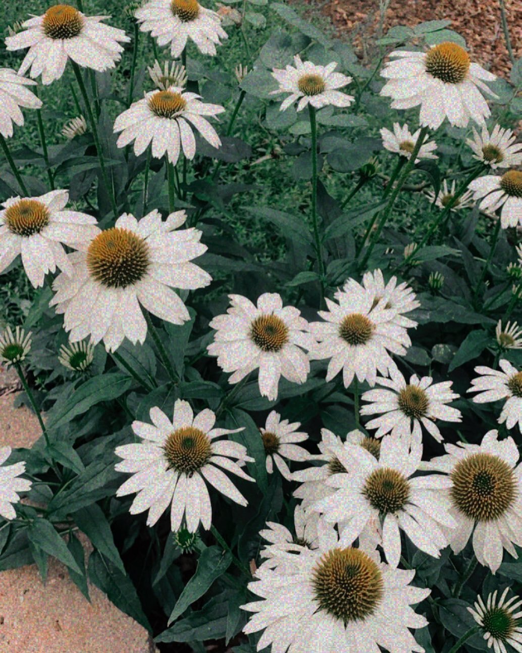
I chose the 'Aviator' template on Squarespace for it's simple design. The Home page had an image as the background with an overlay and the logo. That's it. Straight to the point. For the background image, I knew I was going to use one of the images from my previous adventures and went with a photo from my absolute favorite building so far [below.]
For the rest of the site design, it really came down to customizing the template and adding in all of the brand colors and typefaces, choosing their sizes and placement throughout the site. Once that was completed, I wrote some copy for the About page and Contact page and brought over the two posts I've done, thus far, from The Classy Hippie blog.
For the Blog graphics themselves, I've decided on three different styles - using the crown logo filled in and on a solid background [below], using the crown logo not filled in and placed over an image from one of the adventures [the thumbnail image for this post] and using the street sign logo to place the name of the street I explored within the logo itself as the graphic for that particular post.

And there you have it! A complete brand & website design for Every Street CLT! I had a blast putting this brand together and look forward to creating more graphics and going on many more adventures in the future! To see the final site design click Here>> or click the image below!

Thanks for following along these last three weeks! If you have any further questions or comments about my client process or my design process please share below! I'd love to hear from you!
Love & Blessings,
Genevieve
P.S. Interested in my Design Services? Learn more HERE>>